University Emblem
Identity & Heritage
The University Emblem
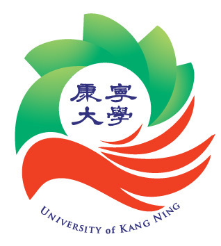
The university emblem features a primary green colour scheme complemented by orange tones, representing Kang Ning University's core values of health and a people-centred philosophy — a visual identity built on care, vitality, and the enduring pursuit of human flourishing.
Green — Health & Well-being
五福 · Five Blessings
The green elements consist of five segments, each representing one of the Five Blessings — longevity, prosperity, health, virtue, and a peaceful end — embodying the university's commitment to holistic student well-being.
Orange — Care & Human Warmth
雙手 · Caring Hands
The orange elements form a soft shape resembling hands, symbolising care and human warmth — a gentle embrace that reflects the university's people-centred approach to education and its deep regard for every student.
Health
Nurturing physical, mental, and social well-being as the foundation of student life.
People-Centred
Placing individuals at the heart of every educational decision and campus interaction.
Innovation
Cultivating a continuous flow of new ideas, creativity, and forward-thinking scholarship.
"Using caring hands to cultivate a continuous flow of new ideas — shaping the future through a people-centred commitment to innovation and creativity."